Save scientists' time by summarizing large amounts of information in a digestible way using AI
Overview
The Science Engine is a powerful platform that allows our users to apply ML models to their workflows, creating huge efficiencies and allowing for new capabilities.
Working with pharmaceutical and bioscience customers to improve their workflows with our platform. I was responsible for leading this project's design efforts, including defining the actual problem, ideation through design refinement, contributing to the user testing plan, and handing off the high-fidelity design specs within a tight timeline to meet an aggressive milestone.
Role
Lead UX Designer
Timeline
2 months
The challenge
How can we synthesize data from thousands of medical papers so scientists can find molecules that degrade specific disease-causing proteins quicker?
What is Science Engine?
A platform that helps users make sense of unstructured data through AI
With partners like UCB to empower scientists to speed up the discovery and development of breakthrough medicines
To find molecules that degrade specific disease causing proteins

Read thousands of research papers
Scientists spend large amounts of times reading through dense literature to find specific molecules that might be relevant to their use case

Compile associated data
They collect individual numbers, parameters, and concentrations from numerous external data sources such as PubChem, patent libraries, and models from Science Engine

Make final decision on list
After all of this data collection, a full story of each molecule is created allowing the scientist to make a decision on which candidates to move forward
Target users

SME Scientists
Discovering connections
Validating a hypothesis
Identifying meaningful signals
Making informed predictions

Info Investigators
Finding something similar
Comparing resources
Summarizing various resources
Why the old Science Engine designs weren’t cutting it
We worked alongside our users to understand their entire workflow and how they have been using the Science Engine previously to understand what was falling short
The current flow
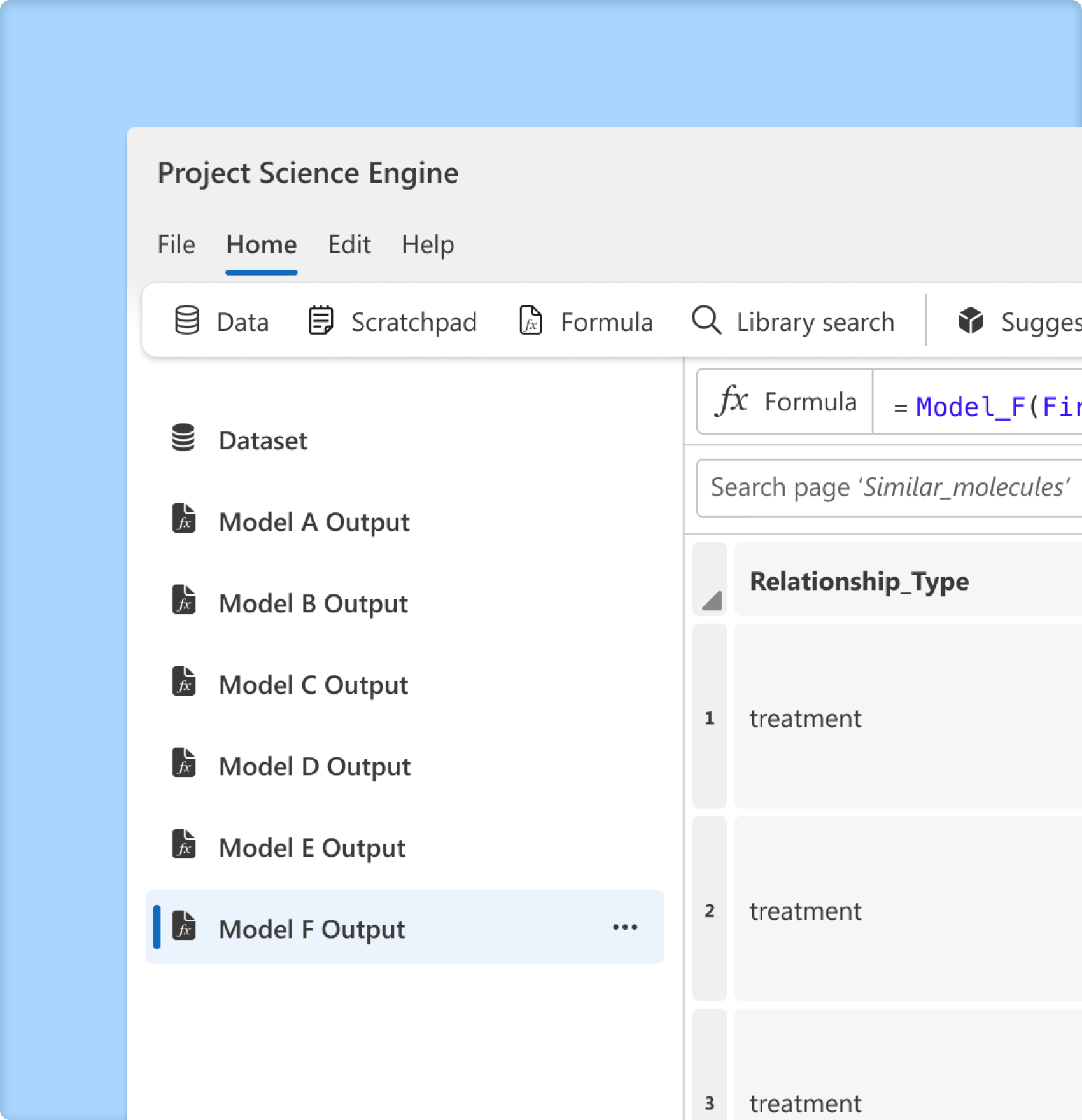
To get to AI generated content, users need to import their data onto the platform and apply a model
In the current experience, an entire page is generated per individual model applied, resulting in many pages with no way of seeing the collection of results in one view

Finding models
Model discovery is limited to a user exploring the current model catalog, which places more responsibility on the user to search and find relevant models for their data

Connecting models
Specific models only work with particular data formats and subject matter types within each dataset
This can lead to users unknowingly applying the wrong model to data that is the correct format but not the correct subject matter leading to null results

Current outputs
It can be challenging to distinguish between the presentation of data and model results, as there is often little visual distinction
This can make it challenging to recognize the role of AI in the process and hard to quickly understand what's going on
The Aha! moment
While working with our users, we uncovered that scientists were essentially building out stories for each molecule, an activity we could automate using AI!
Project goals

Synthesize data
Create a full story summarizing all the necessary information about a specific entity

Provide data access
Allow the user to quickly jump into all of the data associated with each model so they can incorporate it into their workflow

Make AI visual
Make it obvious which content is AI generated and make it easily digestible
Collaboration & ideation
Knowing this project had a time constraint and every moment counted, I initially established points of contact within all teams that would touch this new feature to leverage their diverse perspectives and ideas
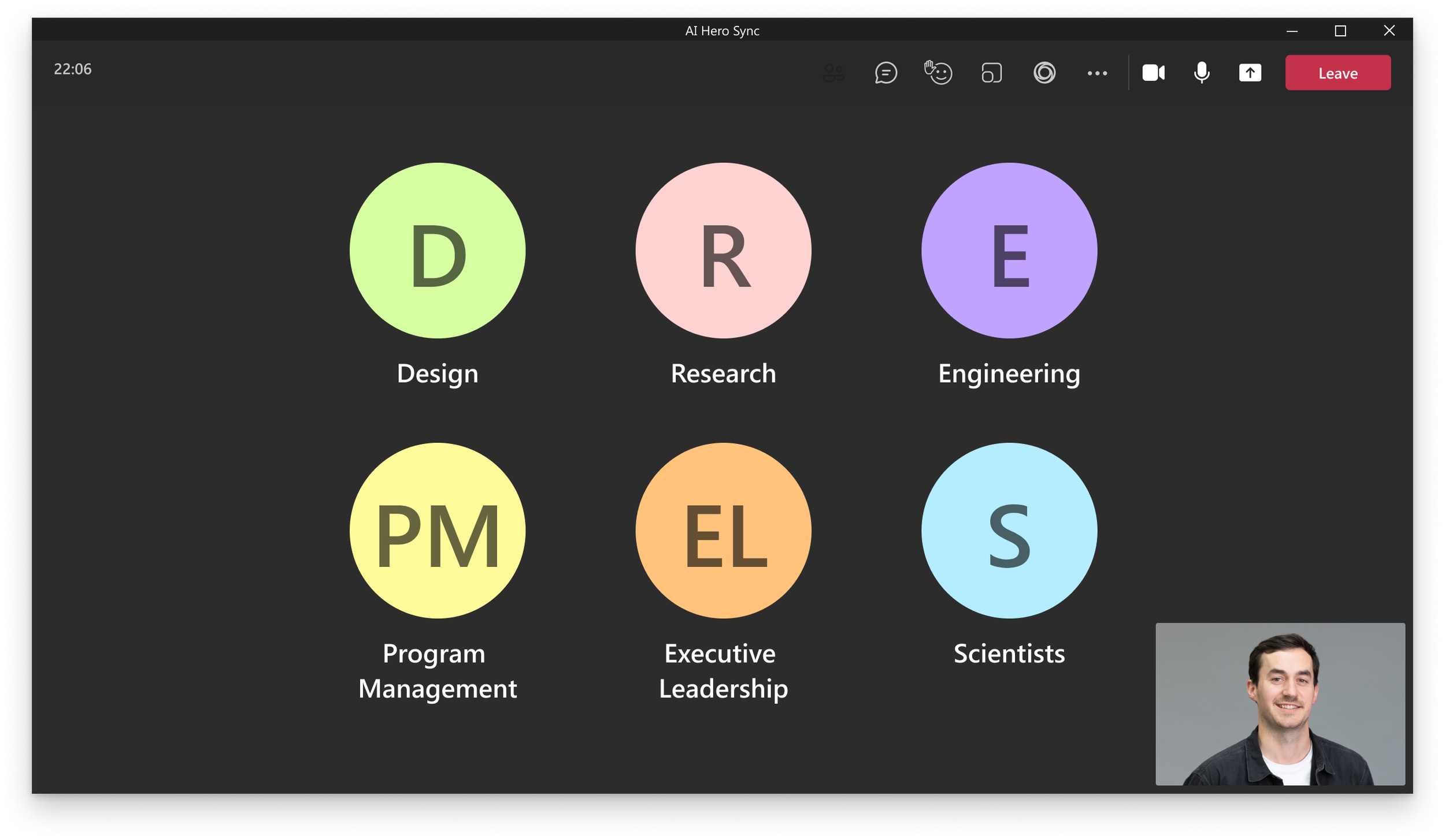
Team collaboration
Met with cross functional stakeholders to fully understand edge cases, constraints, and business objectives

Ideation design sprint
Facilitated a design sprint to leverage the team’s diverse set of perspectives to generate potential ideas and align expectations


Design ideation
Ideating through potential solutions ranging from small incremental changes to entirely new design formats


Design Refinement
Refining the design directions through review and feedback sessions with users and the team


Design Refinement
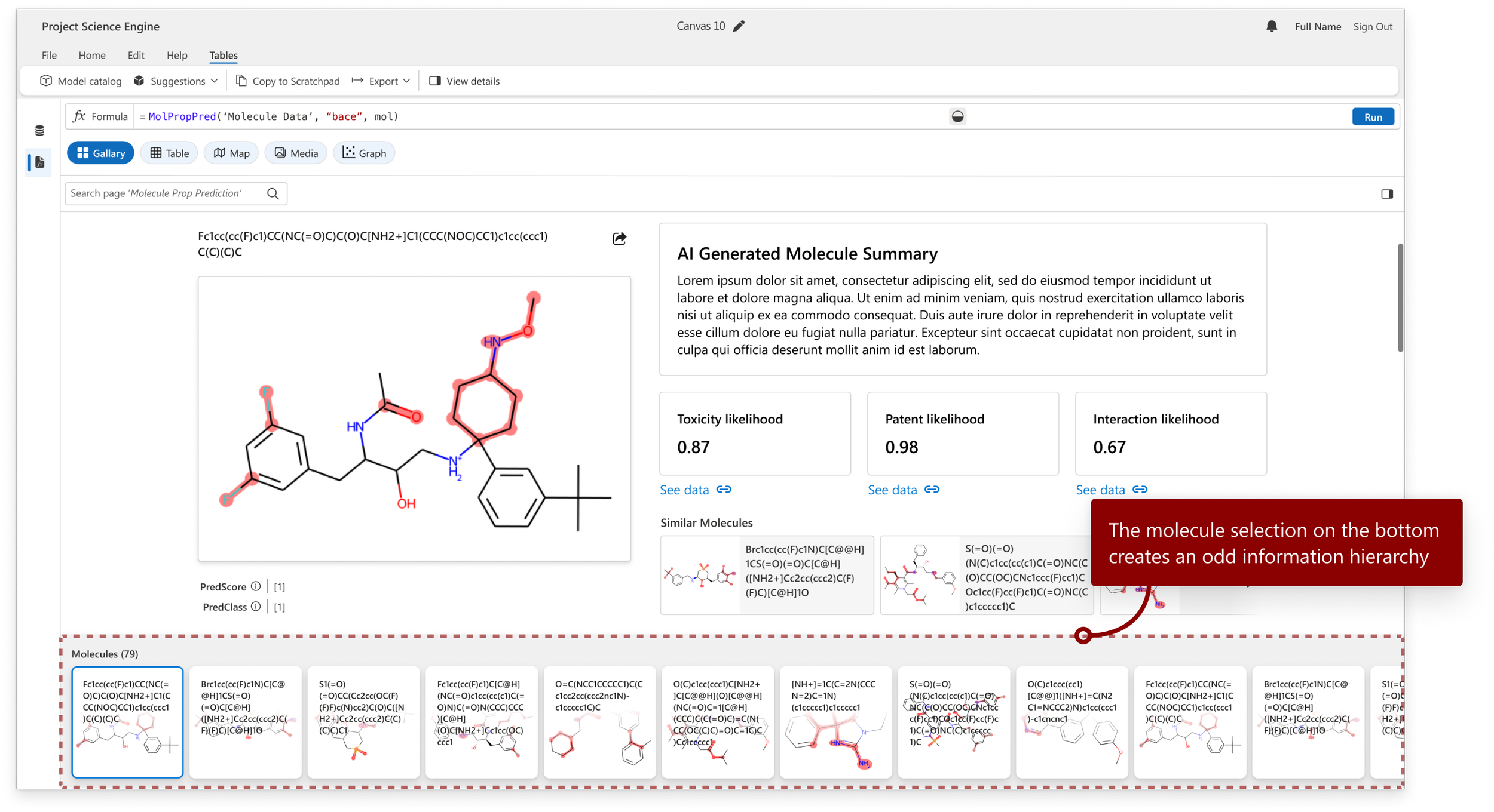
We ultimately landed on a two-column framework that consisted of several different types of sections, making it flexible enough to tell the story of different entity types in an editorial and visual way
Validation
Getting our customer's affirmation that the designs would solve their specific needs. UCB was able to help organize and order the various sections to how they would want to consume them in their workflow
Bioscience Customer
“This would save us so many hours of work…”
Pharmaceutical Customer
“I like how this tells a story
of each molecule.”
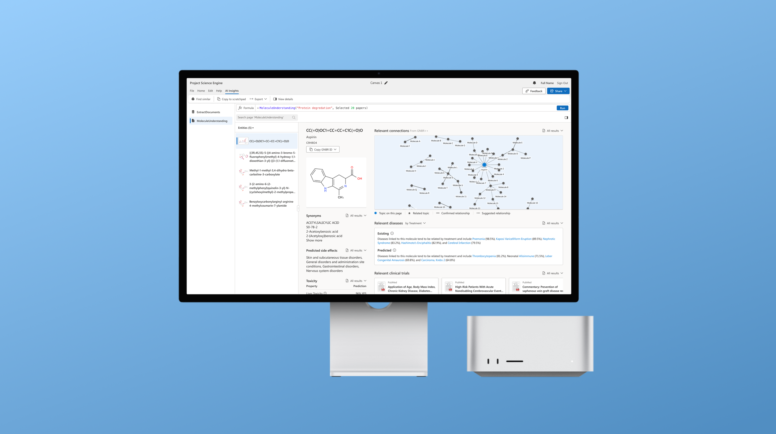
Final design
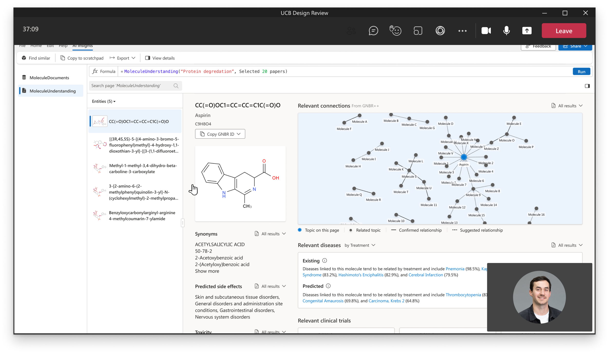
The new AI Hero experience showcased relevant ML models based on the data the user imports onto the platform. Once the molecules from the data are identified, we surface digestible and editorial sections representing entire outputs from various models. The user has all the information needed about a single molecule eliminating the need for the user to scour numerous resources for this desired data and showing just how valuable these models can be for their workflows.

Telling a story
We organized related content in two separate columns based on what scientists would use it for. After validating the content itself and the order in which it appeared, the experience of the molecule AI hero view tells a complete story of the molecule in focus.
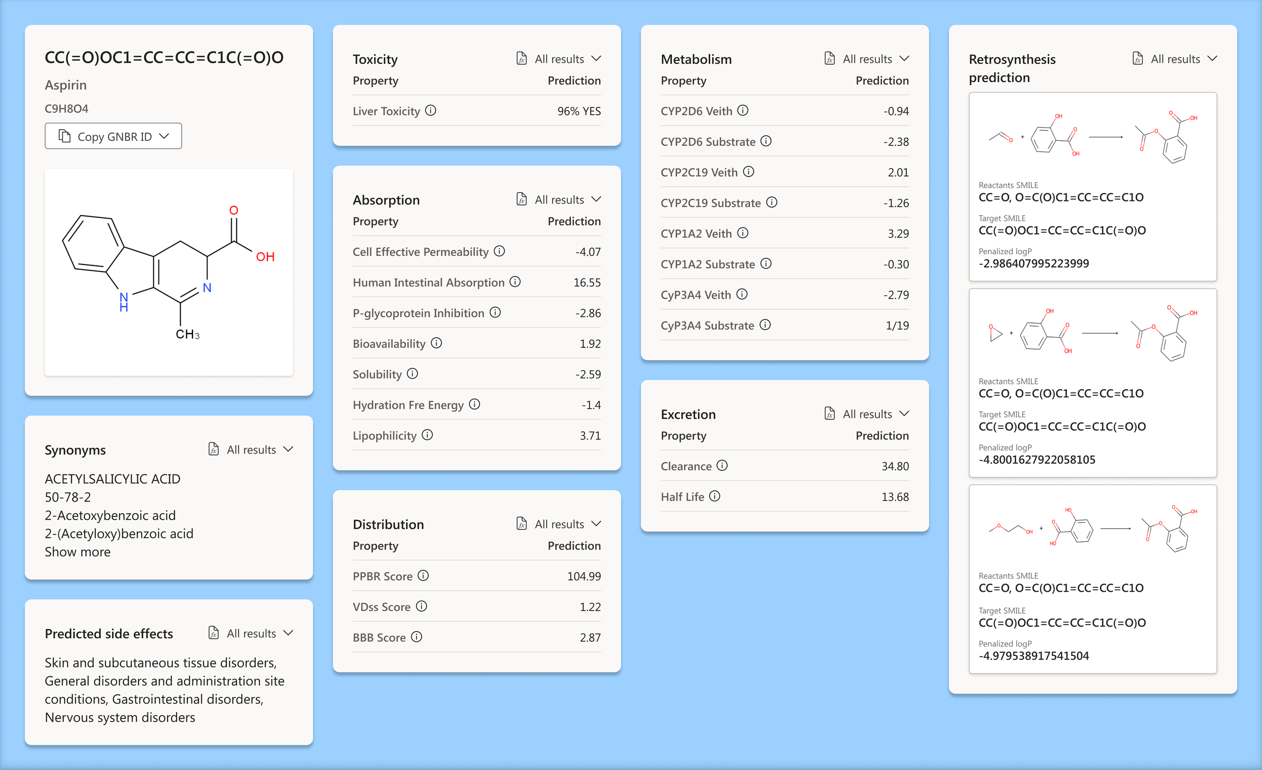
Descriptive data column
This section groups all the information we could pull for a specific molecule. All the complicated data points that scientists search for in one spot in a framework that gives the user what they need to know.

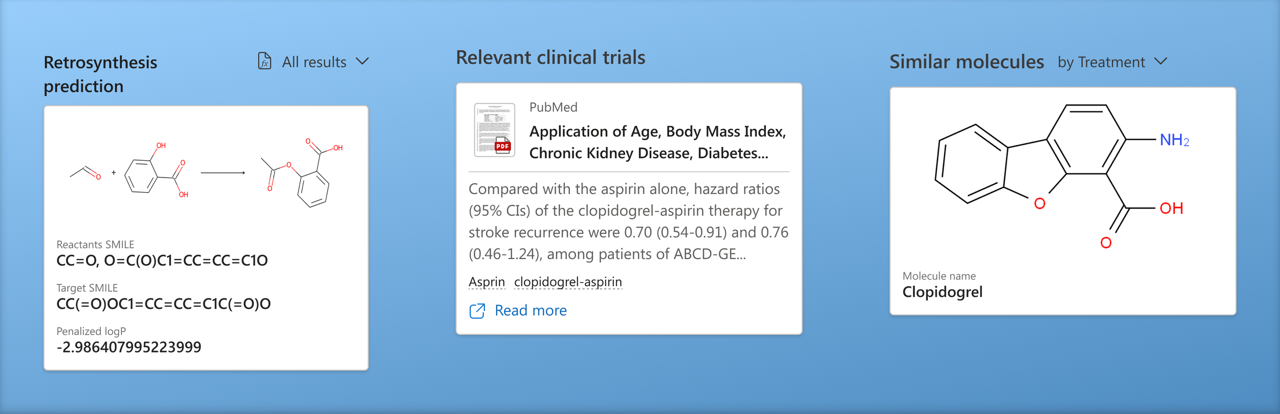
Relevant data column
We added all related content to the selected molecule in the right column. Any related, similar, or relevant information can easily be skimmed and added to a scientist's workflow, all from one view.

We synthesized the data
Creating a framework that communicates top relevant information that a user can quickly skim allows them to scan for interesting bits before diving into the entire dataset
The underlying data is always just a few clicks away allowing users to incorporate interesting information into their workflows

Provided data access
Each section is a condensed highlight of an entire page of data. We made it extremely easy to access the underlying data of each section. This enables them to efficiently incorporate data relevant to their use case.
Made AI visual
Visually anchoring the image of the selected molecule helps users quickly identify the connecting factor between all the information. We also added visual elements such as document thumbnails and entity images to sections to make the results easier to consume.
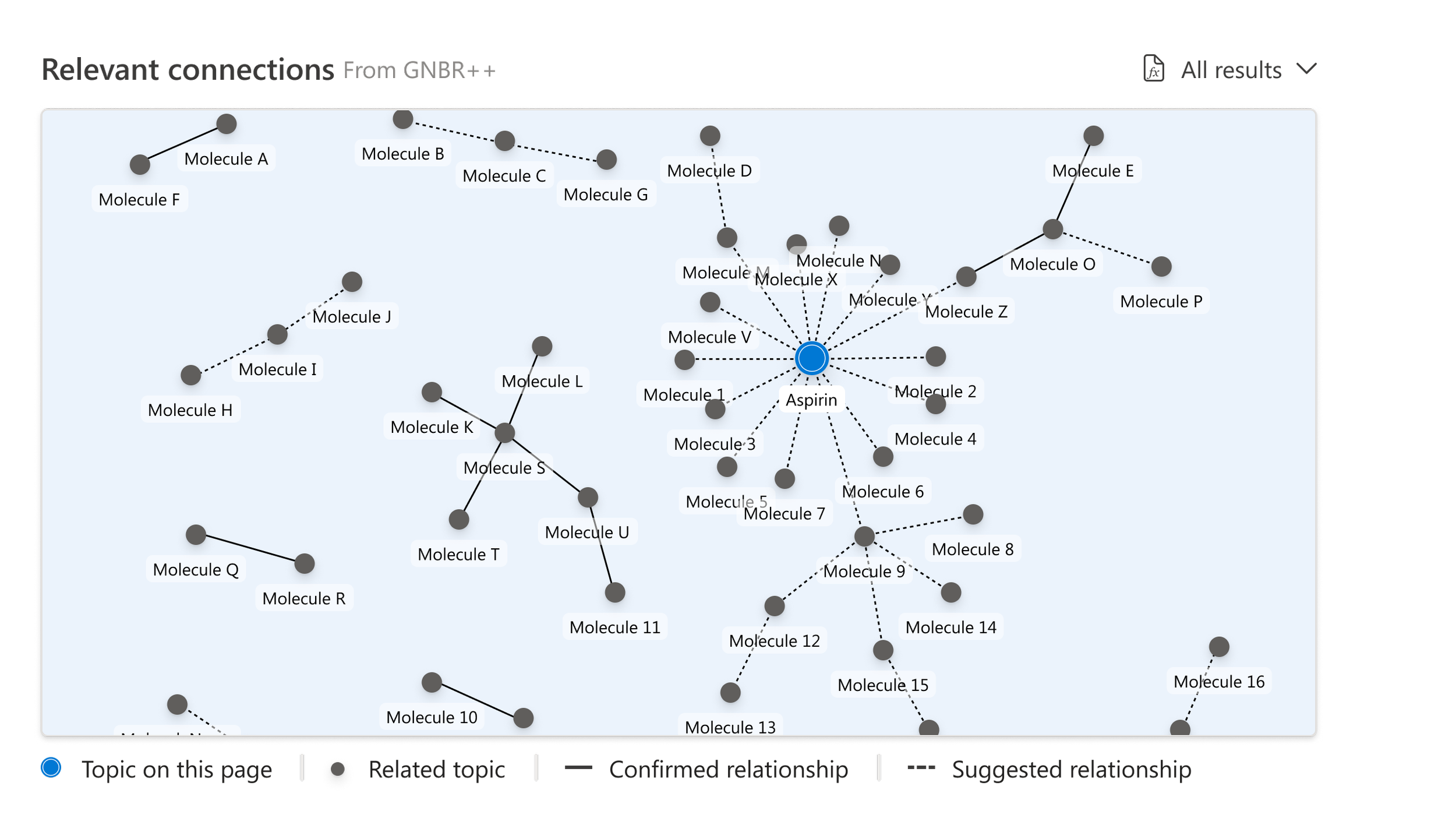
Displaying the knowledge graph!
We display a visual representing relevant connected molecules and the neighboring clusters with confirmed and suggested relationship paths. We pulled this data from the GNBR++ database, a commonly used resource by scientists.

Being able to pivot the sections
Each section is a model output and sums up the results in a digestible way
Following the release…
The first version of the molecule AI Hero experience was successfully launched by the target deadline and met all the significant needs of our users while aligning with business objects. Some compromises needed to be made with engineering to make this milestone include not having underlying data appear on its own tab, more interactive capabilities within the related molecule knowledge graph, and adding more visual representations of the editorial sections. These elements are planned to be incorporated into future versions of the experience.
Impact
Automated the summarization and analysis of information to identify specific protein degrading molecules, reducing scientist's work time by over 75%
New platform feature that summarizes mountains of data in a visual way
Allows access to all connected data from each model
Lessons learned
When moving fast, communicate with as many stakeholders as possible and frequently
Temporary compromises are worth it to move toward the end goal
Prototypes are your friend when working under a tight timeline